June 2025
Machine Learning for Urban Heat Vulnerability Mapping
Dev Patel
A machine learning platform that identifies urban heat vulnerability using satellite-derived Land Surface Temperature (LST), Normalized Difference Vegetation Index (NDVI), and building density. The system produces actionable heat vulnerability maps to guide tree planting and urban development for the City of Toronto. Website · LinkedIn.
Mapping heat, growing green
With ~489,000 heat-related deaths annually and rising, the platform addresses urban heat vulnerability by combining LST, NDVI, and building footprint data into a single ML pipeline. Outputs are designed to support sustainable urban planning and climate resilience—identifying where vegetation is weak and where heat risk is highest so cities can prioritize interventions.
The urban heat crisis
Heat-related mortality is driven by climate change, urban heat islands, and unequal access to cooling and green space. Traditional planning often underweights the link between vegetation, built form, and temperature. Urban heat islands create microclimates that disproportionately affect marginalized communities in areas with less green space and more impervious surface.
We wanted a data-driven way to find these areas before they become health emergencies. This project is a geospatial ML pipeline that puts environmental justice and proactive planning first.
Machine learning approach
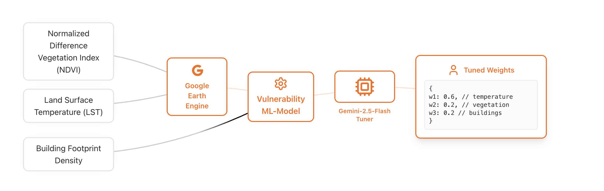
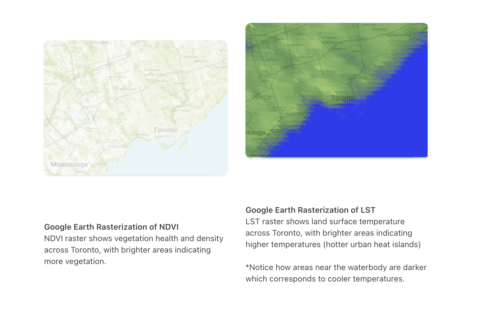
A Random Forest model uses three inputs: Land Surface Temperature (LST), Normalized Difference Vegetation Index (NDVI), and building footprint density. Data infrastructure is provided by Google Earth Engine; Gemini 2.5 Flash is used to help tune model weights.
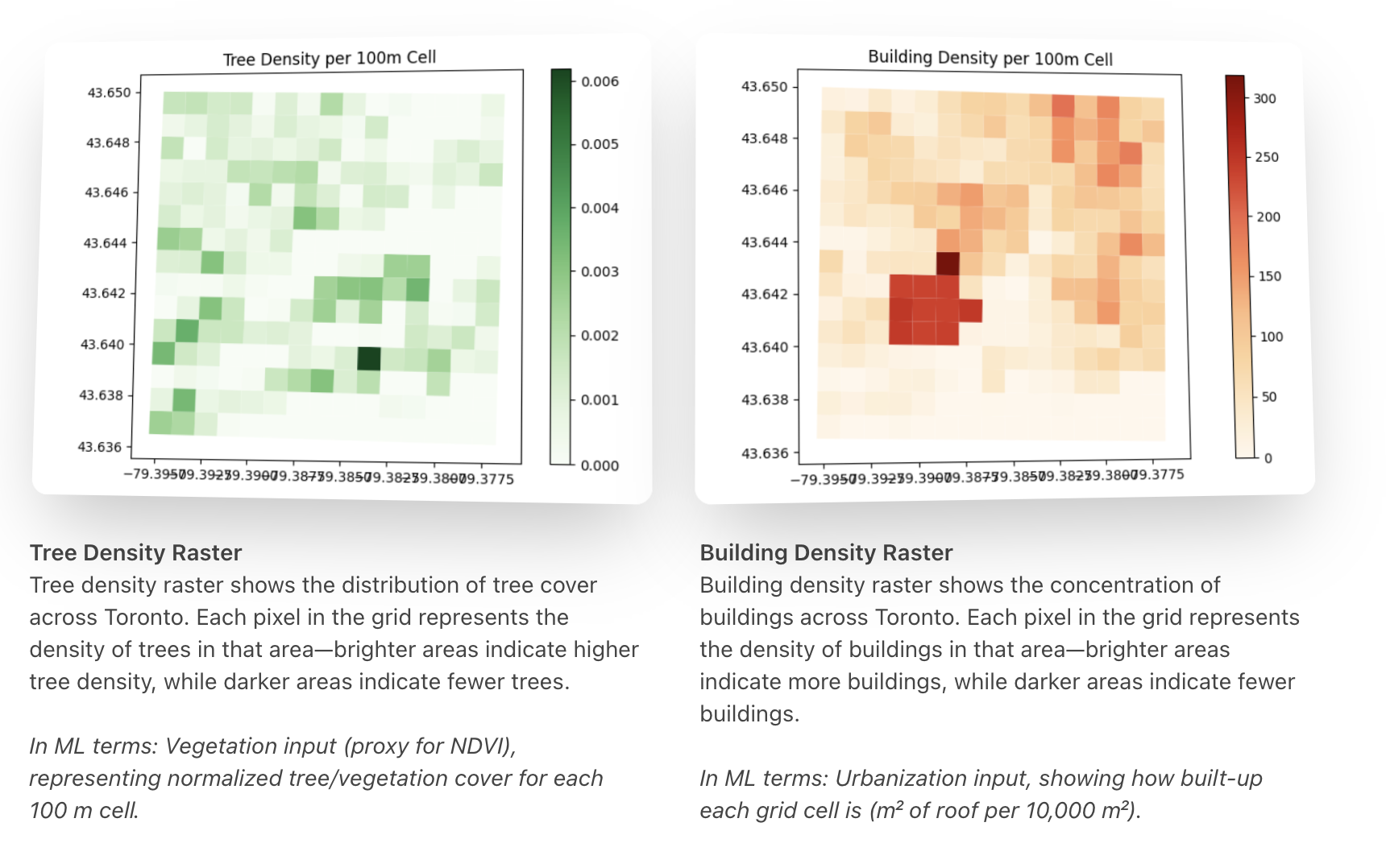
The model uses fixed weights (60% temperature, 20% vegetation, 20% buildings) to produce heat vulnerability scores. Building and tree density are rasterized into a uniform 100 m grid over Toronto to build a feature matrix that captures spatial structure.
Feature extraction and the ML stack surface patterns that are hard to see by eye, giving a consistent way to compare heat vulnerability across different neighbourhoods.
3D data visualization
An interactive 3D city view makes the outputs usable for planners, policymakers, and community groups. Multiple rasters (tree density, building density, temperature) are combined into one explorable interface.
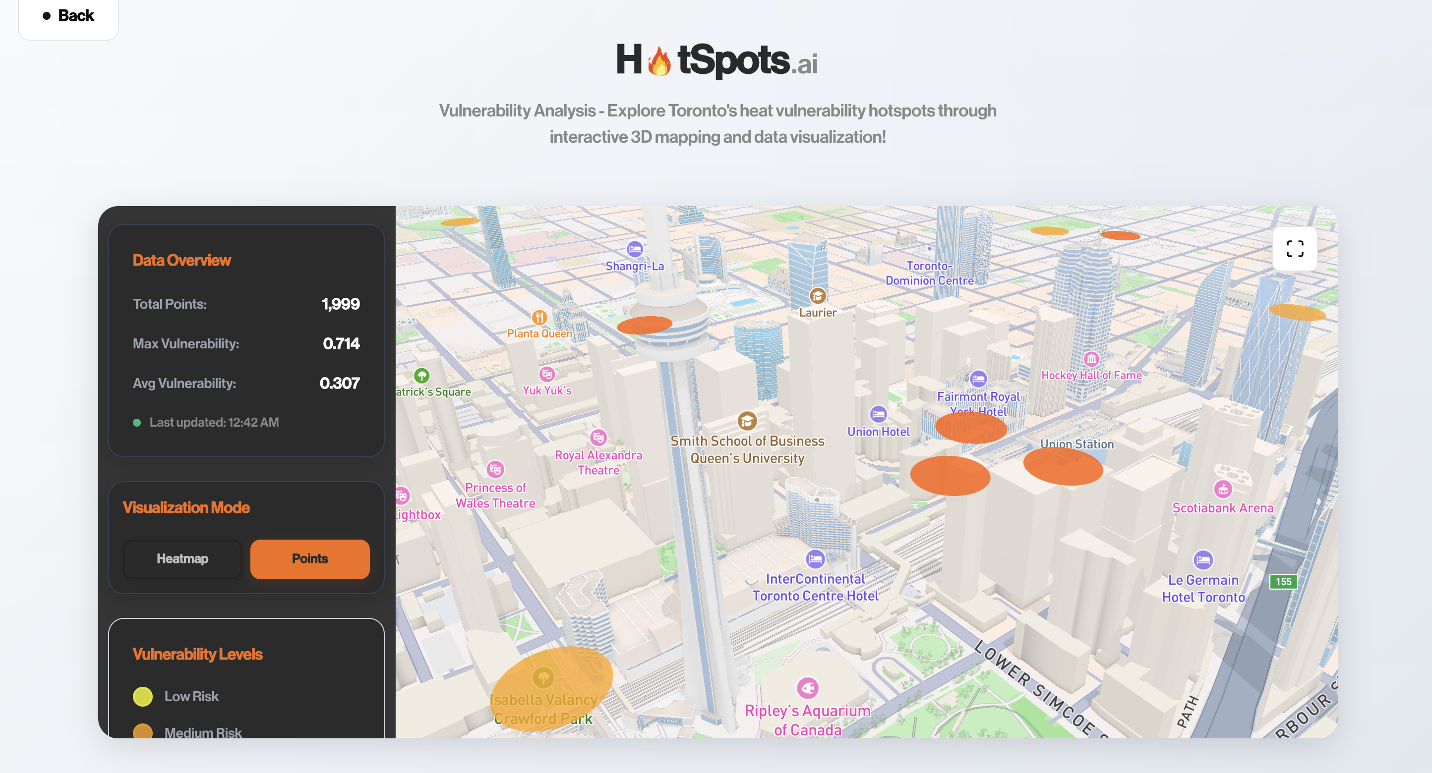
Users can inspect tree density, building density, and temperature in real time, with color-coded heat maps highlighting priority areas. The 3D view adds spatial context that 2D maps miss, turning satellite-derived rasters into decisions about green infrastructure and development.
Future development
Planned work includes extending coverage to other Canadian cities, adding real-time or seasonal weather for dynamic vulnerability, and running scenarios for climate change over the next decade. We’re also looking at integration with municipal planning tools, extreme-heat alerts, and open-source tooling so other cities can run similar assessments.